
/* =========================================================
CHUCK VENDING HERO
DESKTOP + TABLET + MOBILE
========================================================= */ .chuck-v6-hero {
--navy: #08295d;
--red: #ef1428;
--yellow: #ffb800;
--text: #10284d; width: 100vw;
margin-left: calc(50% - 50vw);
overflow: hidden;
background: #ffffff;
font-family: Arial, Helvetica, sans-serif;
} .chuck-v6-inner {
width: 100%;
height: 650px;
display: grid;
grid-template-columns: 48% 52%;
background: #ffffff;
} /* =========================================================
LEFT CONTENT
========================================================= */ .chuck-v6-left {
height: 650px;
box-sizing: border-box; padding:
46px
38px
42px
max(42px, calc((100vw - 1500px) / 2)); display: flex;
flex-direction: column;
justify-content: center; background:
radial-gradient(
circle at 35% 50%,
rgba(64,163,255,0.07),
transparent 45%
),
#ffffff;
} .chuck-v6-location {
display: inline-flex;
align-items: center;
gap: 7px;
width: fit-content; padding: 8px 14px;
margin-bottom: 19px; background: #eaf5ff;
color: #087fe3; border-radius: 100px; font-size: 14px;
font-weight: 700;
} .chuck-v6-location svg {
width: 15px;
height: 15px;
} .chuck-v6-title {
margin: 0; color: var(--navy); font-size: clamp(43px, 4vw, 66px);
line-height: 0.96;
letter-spacing: -2.4px; font-weight: 900;
text-transform: uppercase;
} .chuck-v6-title span {
display: block;
color: var(--red);
} .chuck-v6-description {
margin-top: 21px;
max-width: 680px; color: var(--text); font-size: clamp(17px, 1.25vw, 21px);
line-height: 1.38;
} .chuck-v6-description strong {
font-weight: 800;
} /* =========================================================
REVIEWS
========================================================= */ .chuck-v6-reviews {
display: flex;
align-items: center;
gap: 14px; margin-top: 21px; flex-wrap: wrap;
} .chuck-v6-stars {
color: var(--yellow);
font-size: 27px;
line-height: 1;
} .chuck-v6-review-text {
color: var(--navy); font-size: 17px;
font-weight: 800;
} /* =========================================================
BUTTONS
========================================================= */ .chuck-v6-buttons {
display: flex;
align-items: center;
gap: 14px; margin-top: 23px; flex-wrap: wrap;
} .chuck-v6-button {
min-height: 56px; padding: 0 26px; display: inline-flex;
align-items: center;
justify-content: center; box-sizing: border-box; border-radius: 11px; text-decoration: none !important; font-size: 17px;
font-weight: 800; transition: 0.2s ease;
} .chuck-v6-primary {
background: var(--red);
color: #ffffff !important; box-shadow:
0 8px 18px rgba(239,20,40,0.16);
} .chuck-v6-primary:hover {
background: #d90f24;
transform: translateY(-2px);
} .chuck-v6-secondary {
background: #ffffff;
color: var(--navy) !important; border: 2px solid #1687e9;
} /* =========================================================
EVENT CARDS
========================================================= */ .chuck-v6-events {
display: grid;
grid-template-columns: repeat(4, 1fr); gap: 11px; max-width: 650px; margin-top: 23px;
} .chuck-v6-event {
min-height: 120px; display: flex;
flex-direction: column;
justify-content: center;
align-items: center; padding: 10px 6px; box-sizing: border-box; background: #ffffff; border: 1px solid #e6eaf0;
border-radius: 14px; box-shadow:
0 5px 15px rgba(0,0,0,0.045); text-align: center;
} .chuck-v6-icon {
width: 60px;
height: 60px; display: grid;
place-items: center; margin-bottom: 7px; border-radius: 50%;
} .chuck-v6-event:nth-child(1) .chuck-v6-icon {
background: #ffe4e8;
color: #ee132a;
} .chuck-v6-event:nth-child(2) .chuck-v6-icon {
background: #e2f2ff;
color: #1787e8;
} .chuck-v6-event:nth-child(3) .chuck-v6-icon {
background: #f0e3ff;
color: #812ed7;
} .chuck-v6-event:nth-child(4) .chuck-v6-icon {
background: #dff7e9;
color: #159b58;
} .chuck-v6-icon svg {
width: 38px;
height: 38px;
display: block;
} .chuck-v6-event-name {
color: var(--navy); font-size: 14px;
line-height: 1.06; font-weight: 800;
} /* =========================================================
DESKTOP PHOTO
========================================================= */ .chuck-v6-photo {
width: 100%;
height: 650px; display: flex;
align-items: center;
justify-content: center; overflow: hidden; background: #ffffff;
} .chuck-v6-photo img {
width: 100% !important;
height: 100% !important; max-width: 100% !important;
max-height: 650px !important; object-fit: contain !important;
object-position: center !important; display: block !important; margin: 0 !important;
padding: 0 !important;
} /* =========================================================
TABLET
768px - 1100px
PHOTO + TEXT VISIBLE TOGETHER
========================================================= */ @media (min-width: 768px) and (max-width: 1100px) { .chuck-v6-hero {
width: 100%;
margin-left: 0;
} .chuck-v6-inner {
width: 100%;
height: auto; display: flex;
flex-direction: column; background: #ffffff;
} /* PHOTO FIRST, BUT SHORTER */ .chuck-v6-photo {
order: 1; width: 100%;
height: 390px; display: flex;
align-items: center;
justify-content: center; margin: 0;
padding: 0; overflow: hidden; background: #ffffff;
} .chuck-v6-photo img {
width: 100% !important;
height: 100% !important; max-width: 100% !important;
max-height: 390px !important; object-fit: contain !important;
object-position: center center !important; display: block !important; margin: 0 !important;
padding: 0 !important;
} /* TEXT IMMEDIATELY BELOW */ .chuck-v6-left {
order: 2; width: 100%;
height: auto;
min-height: 0; box-sizing: border-box; padding: 20px 34px 28px; display: flex;
flex-direction: column; background: #ffffff;
} .chuck-v6-location {
margin-bottom: 10px; padding: 7px 12px; font-size: 13px;
} .chuck-v6-title {
font-size: 42px;
line-height: 0.98; letter-spacing: -1.5px;
} .chuck-v6-description {
margin-top: 12px; max-width: 760px; font-size: 16px;
line-height: 1.3;
} .chuck-v6-reviews {
margin-top: 13px; gap: 10px;
} .chuck-v6-stars {
font-size: 22px;
} .chuck-v6-review-text {
font-size: 15px;
} .chuck-v6-buttons {
margin-top: 14px; gap: 10px;
} .chuck-v6-button {
min-height: 48px; padding: 0 20px; font-size: 15px;
} .chuck-v6-events {
width: 100%;
max-width: 760px; grid-template-columns: repeat(4, 1fr); gap: 9px; margin-top: 15px;
} .chuck-v6-event {
min-height: 94px; padding: 7px 4px;
} .chuck-v6-icon {
width: 46px;
height: 46px; margin-bottom: 5px;
} .chuck-v6-icon svg {
width: 29px;
height: 29px;
} .chuck-v6-event-name {
font-size: 12px;
}
} /* =========================================================
MOBILE
========================================================= */ @media (max-width: 767px) { .chuck-v6-hero {
width: 100%;
margin-left: 0;
} .chuck-v6-inner {
width: 100%;
height: auto; display: flex;
flex-direction: column;
} /* IMAGE FIRST */ .chuck-v6-photo {
order: 1; width: 100%;
height: auto; display: block; margin: 0;
padding: 0; overflow: visible;
} .chuck-v6-photo img {
width: 100% !important;
height: auto !important; max-height: none !important; object-fit: contain !important; display: block !important;
} /* CONTENT */ .chuck-v6-left {
order: 2; width: 100%;
height: auto;
min-height: 0; padding: 24px 16px 22px; box-sizing: border-box; text-align: left; background: #ffffff;
} .chuck-v6-location {
margin: 0 0 16px 0; padding: 7px 12px; font-size: 13px;
} .chuck-v6-title {
font-size: clamp(32px, 9vw, 42px); line-height: 0.98;
letter-spacing: -1.4px;
} .chuck-v6-description {
margin-top: 15px; font-size: 16px;
line-height: 1.35;
} .chuck-v6-reviews {
margin-top: 17px; gap: 10px; flex-wrap: nowrap;
} .chuck-v6-stars {
font-size: 22px;
} .chuck-v6-review-text {
font-size: 14px;
white-space: nowrap;
} .chuck-v6-buttons {
width: 100%; margin-top: 18px; display: block;
} .chuck-v6-button {
width: 100%;
min-height: 58px; font-size: 18px;
} .chuck-v6-secondary {
display: none !important;
} .chuck-v6-events {
width: 100%;
max-width: none; margin-top: 14px; grid-template-columns: repeat(4, minmax(0, 1fr)); gap: 6px;
} .chuck-v6-event {
min-height: 105px; padding: 8px 2px; border-radius: 11px;
} .chuck-v6-icon {
width: 47px;
height: 47px;
} .chuck-v6-icon svg {
width: 30px;
height: 30px;
} .chuck-v6-event-name {
font-size: 11px;
}
} /* SMALL PHONES */ @media (max-width: 390px) { .chuck-v6-left {
padding-left: 13px;
padding-right: 13px;
} .chuck-v6-title {
font-size: 31px;
} .chuck-v6-description {
font-size: 15px;
} .chuck-v6-stars {
font-size: 19px;
} .chuck-v6-review-text {
font-size: 12px;
} .chuck-v6-event {
min-height: 98px;
} .chuck-v6-icon {
width: 43px;
height: 43px;
} .chuck-v6-icon svg {
width: 27px;
height: 27px;
} .chuck-v6-event-name {
font-size: 10px;
}
}
Dallas–Fort Worth, TX
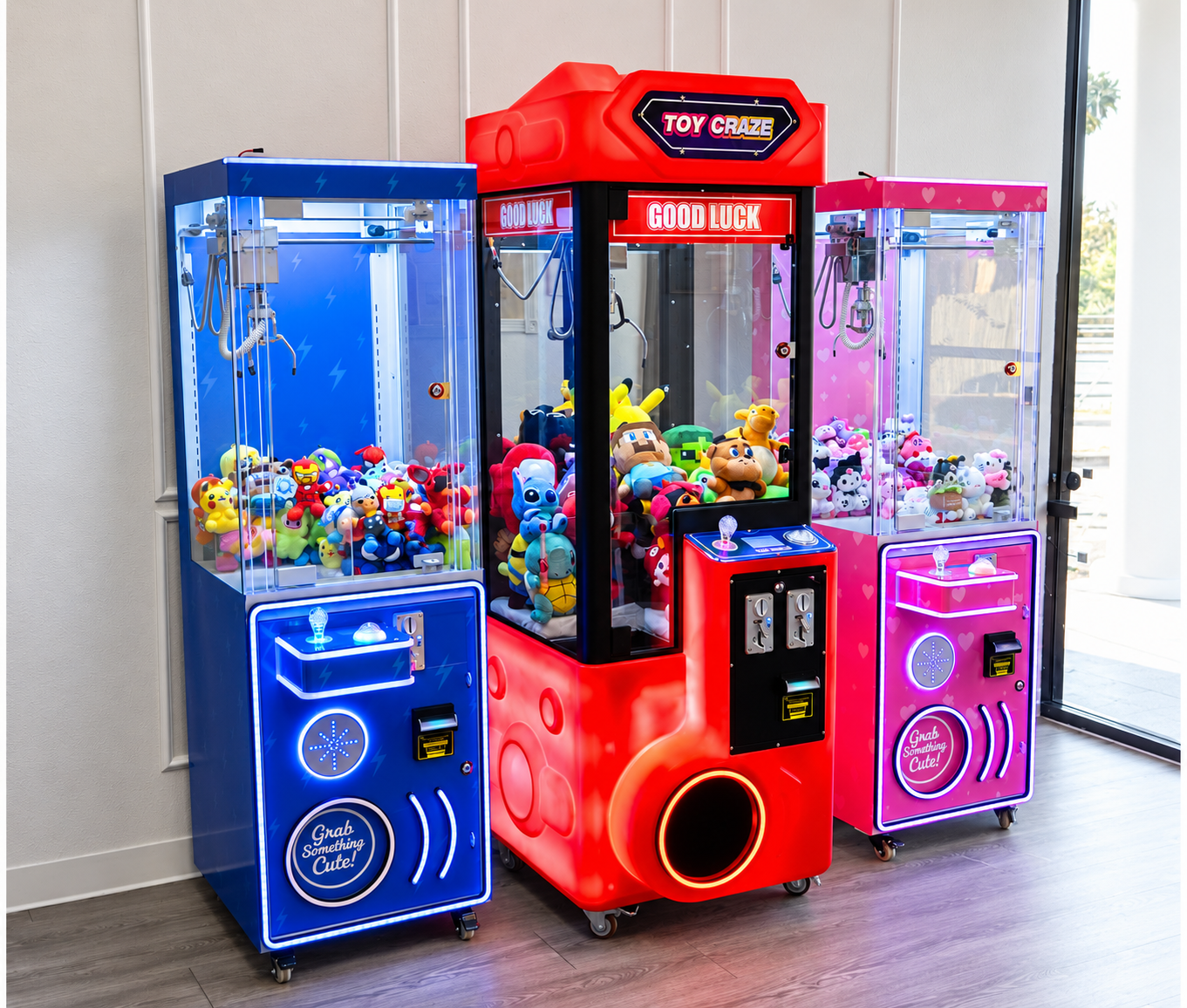
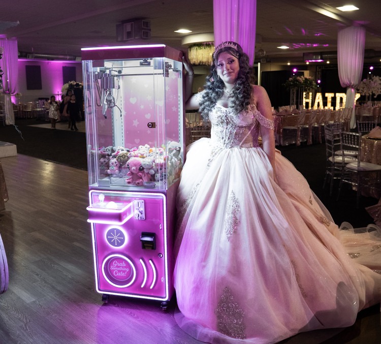
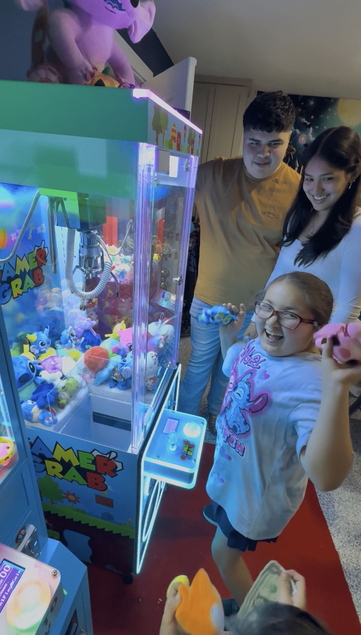
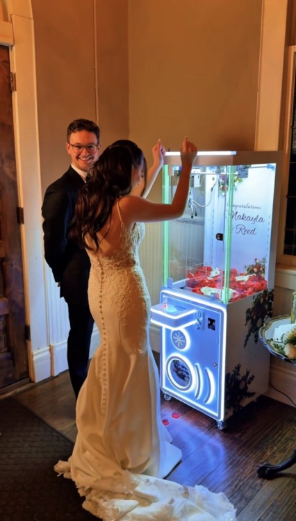
DFW Claw Machine Rentals
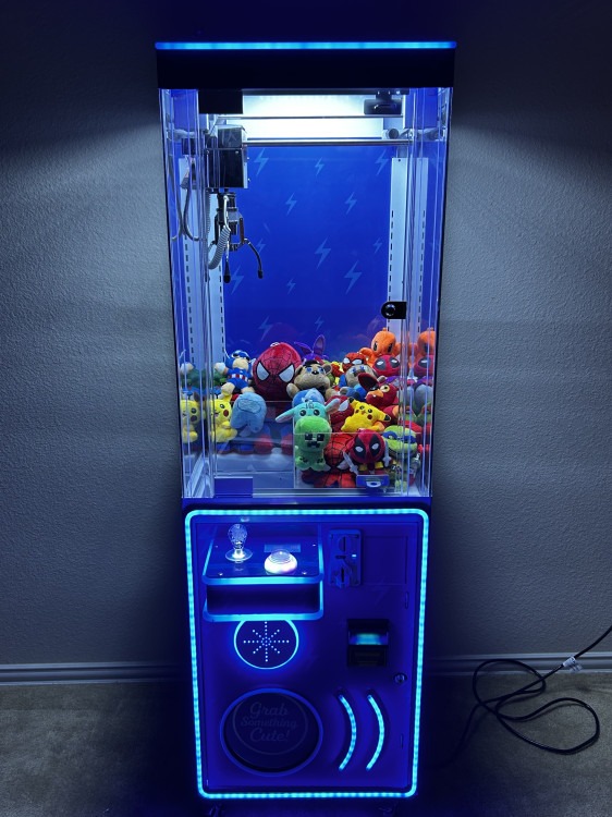
Free-to-play claw machines with prizes included.
Delivery, setup & pickup throughout Dallas–Fort Worth.
★★★★★
55+ Five-Star Google Reviews